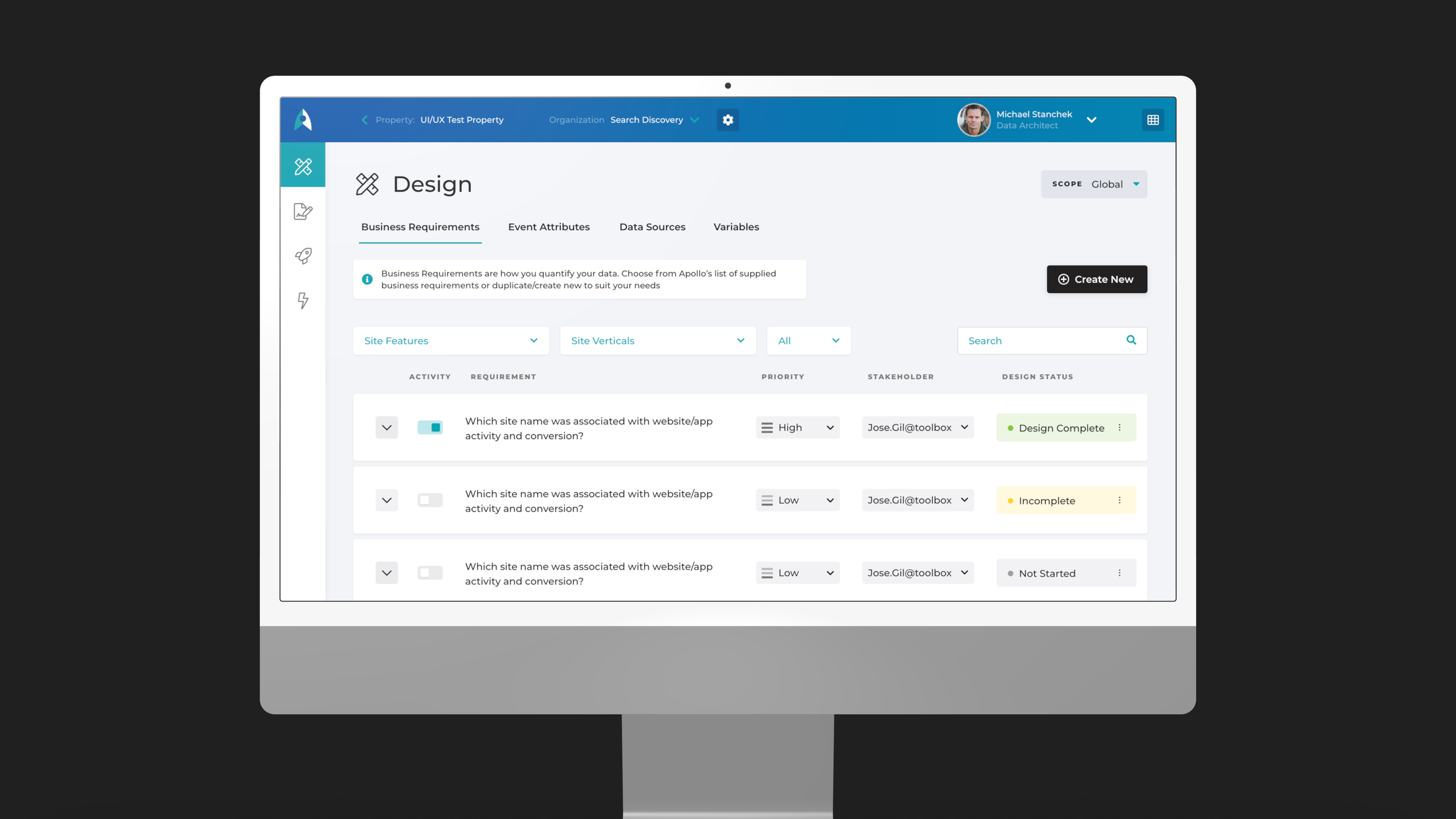
Description
Sometimes a product needs a complete revision. This happens for many reasons, but from a design perspective, it’s usually a disconnection with modern task flows, patterns, branding or technology. This project was focused on updating task flows and applying a fresh branding / UI. The largest challenge was understanding the complex nature of how users navigate this analytics platform and the implications of streamlining those processes. Functionally this project was done in partnership with another consulting firm as a unified UX team.
Phases & Methods
Discovery: Workshopping Sessions, Desk Research, Moodboarding, Stakeholder interviews
Analysis: Architecture, Journey Mapping, Lo-Fidelity prototyping
Design: UI Design, Design System, UX Design, Hi-Fidelity Prototyping
Validation: User Testing (executed by the client)
The project started with a thorough workshop and discovery phase. We needed to collect a wealth of information and understand the context of use cases, scenarios, and, most importantly, the users involved. Analytics workflows involve heavy data sets, databases, and linking connections between that data and other services. This complexity was the aim of efforts to streamline the product.
One of many mental models mapped with collaboration with the client in the workshopping sessions.
Concepting with minimalist UI for speedy idea generation
This project required a large amount of screens to be generated with many different interactions and patterns to explore.
Working with well-designed but lo-fidelity components allowed for an agile workflow, increasing the amount of ideas to explore.
Final visual design and build
A traditional approach was taken for deciding on the visual identity of the app. A moodboard was created with a myriad of design styles and in partnership with the client a direction was decided.
Color was used as a tool to help the users associate components with their correlating workflows. This approach tested well with the client and their internal users.
Like what you See?
•
Like what you See? •
Interested in learning more?


